Special K King
Tuesday, March 29, 2011
1960's logo
Paul Rand 's 1965 redesign of the trademark for the American Broadcasting Company reduced the information to its simple essence while achieving a memorable and unique image. The continuing legacy of the Bauhaus and Herbert Bayer's universal alphabet informs this trademark, in which each letterform is reduced to its most elemental configuration.
logoorange.com
Tuesday, February 22, 2011
1930s
Mazda began its life in 1920 as the Toyo Cork Kogyo Co. in Hiroshima, Japan. At the time, there was a cork shortage because of World War I, so the company was founded to process a cork substitute made from the bark of an Abemaki or Chinese cork oak tree. It was a good idea at the time, but shortly afterwards Japan could get real cork again and the company foundered.
In 1927, Jujiro Matsuda came onboard and the company began manufacturing tools, three-wheeled "trucks" and then cars. After World War II, the company formally adopted the name Mazda, which depending on who you ask, stood for the Zoroastrian god Ahura Mazda or an anglicized pronunciation of Matsuda the founder’s name (or both).
In the 1936 logo, the M shaped curve was inspired by the emblem of Hiroshima city. The 1991 and 1992 logos symbolized a wing, the Sun and a circle of light. Mazda’s current logo, nicknamed the "owl" logo, was designed by Rei Yoshimara in 1997. The stylized "M" was meant to look like stretched wings, but many people saw a stylized tulip instead.
http://www.neatorama.com/2008/02/18/evolution-of-car-logos/
Tuesday, February 15, 2011
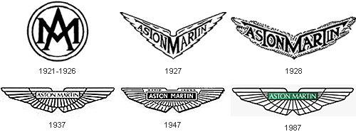
In 1913, Lionel Martin and Robert Bamford founded a company that later would become Aston Martin. At the time, Martin & Bamford Limited produced Singers racing cars, but the duo wanted to create a more sophisticated model of their own. They named their first car Aston Martin after the founder Lionel Martin and the Aston Clinton hill climb racing course where their Singers car had won previously.
We can’t talk about Aston Martin without mentioning James Bond. In 1959, Ian Fleming put his super spy James Bond in an Aston Martin DB Mark III. When it was made into a movie in 1964, Bond drove an updated, supersleek silver Aston Martin DB5 (complete with machine gun, passenger ejector seat, and revolving number plates!)
Thursday, February 10, 2011
1900 logo
The Mercedes-Benz logo is one of the most famous brands in the wor;d. The Benz logo is a simplistic three-pointed star that represents its domination of the land, the sea, and the air. The famous three-pointed star was designed by Gottlieb Daimler to show the ability of his motors for land, air and sea-usage. It was first seen on a Daimler in 1909, and was combined with the Benz laurel wreath in 1926 to signify the union of the two firms. Mercedes-Benz is the world's oldest automobile manufacturer. When the patented name "Mercedes" was registered in September 1902 Daimler Motoren Gesellschaft had a successful brand name but still lacked a characteristic trademark. Then Paul and Adolf Daimler - the company founder’s two sons, and now in charge of the business - remembered that their father had once used a star as a symbol. |
Tuesday, February 1, 2011
Slavia Logo (1895 – 1905)
Bicycles and motorcycles were made at the Mladá Boleslav workshop under the Slavia brand. The logo was based on a wheel with lime leaves, which were to symbolise the Slav nations. The names of the company’s founders (Laurin & Klement) were added and later became the main motif for the new logo.
L&K Logo (1905-1925)
The design of the L&K logo was influenced by Art Nouveau, an artistic style at the beginning of the 20th century. The initials of the company’s two founders are (probably in connection with the name Václav Laurin or laurel, lat. laurus nobilis) surrounded by laurels in the shape of a wreath, which has been associated with victors and the famous since antiquity. The laurels possibly foretold the success of L&K.
Škoda Logo (1926-1933)
Cars were produced in Mladá Boleslav under the Škoda brand from 1926. Although the brand’s name changed completely, the form of the new product logo shows continuity with the previous stage. The Škoda logo has a new, oval shape, but the brand name is still the dominant element in the centre and is surrounded by laurels.
Škoda Logo (1926-1990)
The logo with the famous “winged arrow” was first used in 1926. Its origin is shrouded in mystery, sometimes the author of the idea (the stylised head of an Indian wearing a headdress with five feathers) is said to be the commercial director of Škoda Plzeň, T. Maglič. The blue and white circular logo, which is completed by a right-moving winged arrow with a stylised pinion, is currently used on some original Škoda parts (e.g. on window glass and engine blocks). Škoda Logo (since 1999)
Although the Škoda logo is viewed as one of the most original and stylistically clean manufacturing company trademarks in the world, the author is not yet known. The black and green logo, which has been used since 1994, gives the Škoda brand a greater degree of originality – black symbolises the hundred-year tradition, green signalises environmental production.
Subscribe to:
Posts (Atom)